
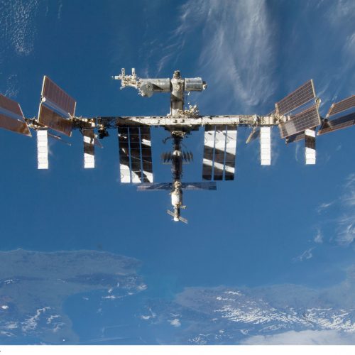
Now that is a good picture of a space station. Bigger here.
Now that is a good picture of a space station. Bigger here.
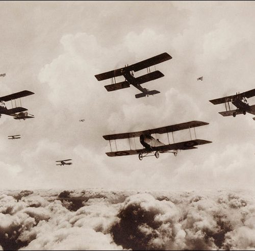
WWI bombers.
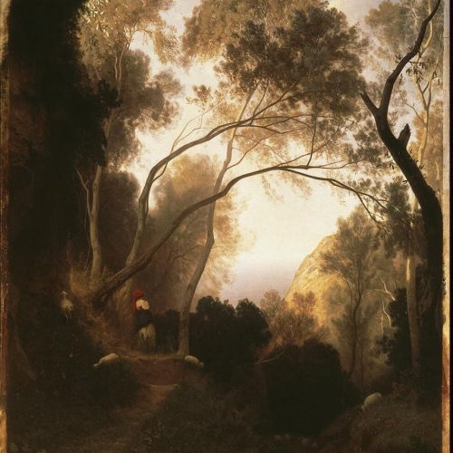
More Fontanesi. God, the man could paint.
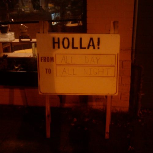
Sign on my street last night.
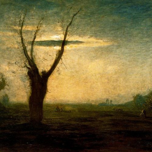
The album art for Cul de Sac’s Death of the Sun has always intrigued me. Not having a physical copy of the album meant I had no access to the liner notes. I decided that I needed to know who the painter was, and put it up on Ask Metafilter. No luck, although they turned me on to Corot. One person had the contact info for the album art designer, whom I emailed – and shortly after got a reply from the main guy in the band. The artist is Antonio Fontanesi, a Barbizon school painter who actually lived in Japan during their 19th century policy of isolation.
There are a few of his paintings available in high quality here, including “Aprile,” (above) which was cropped down for Death of the Sun. Very desolate, very beautiful.
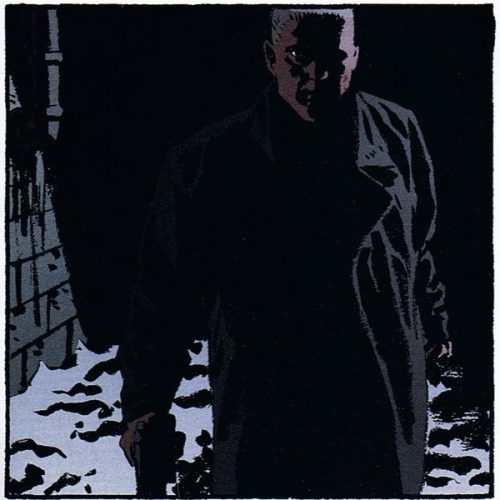
Great frame from Criminal, a relatively new comic from Ed Brubaker and Sean Phillips.
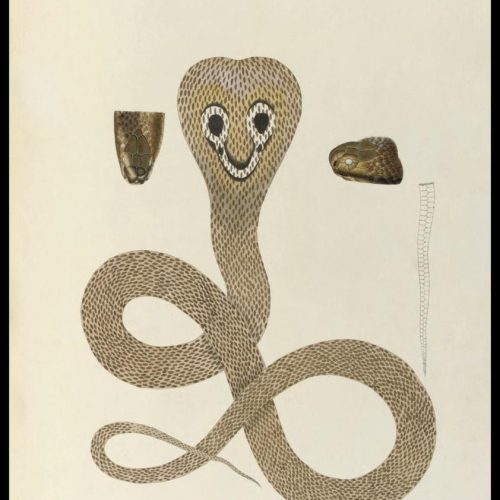

Oh, how pretty! Kansas from space. Very geometric. The original is here.
It actually reminds me of this meta-heraldic shield.
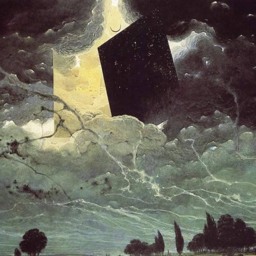
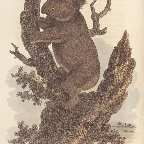
Koalo.
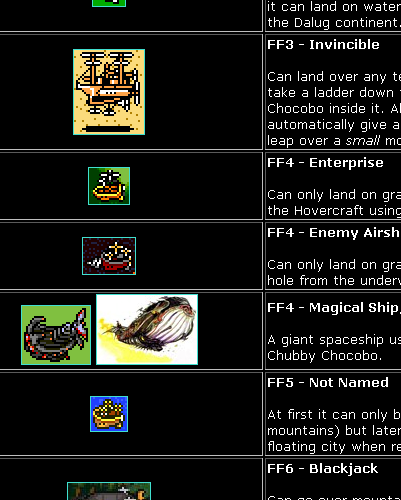
This is great. Final Fantasy Compendium has (as one would expect from a compendium) a listing of all the airships and other forms of transportation you can take in the Final Fantasy games. Love them pixels.

Google Books is now hosting a huge amount of Life Magazines as well as just the photos. I’ll have to check out some momentous occasions later.
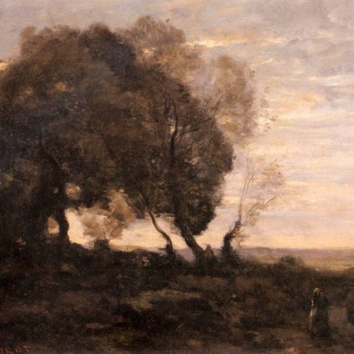
Another painter to add to my stable of favorites: Jean-Baptiste-Camille Corot. I recognize a few of his works but I’m surprised I hadn’t heard more of him before. Monet said of him, “We are nothing compared to him, nothing.”
Here is a complete archive of his works, in medium resolution.
Some other favorites:
The Evening
Souvenir of Ville d’Avrille
Winter Scene
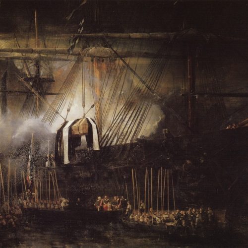
Transfer of Napoleon’s ashes aboard the Belle Poule, October 15, 1840 (Louis Eugène Gabriel Isabey)
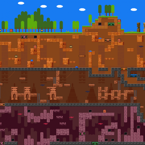
Wow, I just finished playing this fantastic little game. Check out that screenshot – and you go through like four more layers than it shows. Absolutely great.
Hilarious rundown of the items and characters in The Legend of Zelda, pointing out the obviously ridiculous nature of many of them. Fun reading.

Good lord. Say what you will about the service, but that’s the ugliest logo Google’s ever made.

No offense to our artists (Bryce, did you do this?!) but this logo is a typography disaster. Every single element is a different style – not to mention the fact that the 50 and bubble don’t line up with TC correctly. Am I just oversensitive to these things?
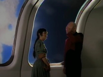
A different Picard facepalm, so you people on the internet can try a DIFFERENT ONE EVERY ONCE IN A WHILE, COME ON!

Why iTunes needs a Lite version. (by me)

Scene Missing Magazine’s photoset of Dragoncon. Wow, that looks … pretty amazing. Unfortunately, I never can have fun at those things because the people freak me out. The whole idea of putting yourself on parade feels wrong to me and I can’t interact with people who are fabricating themselves wholesale. Still, makes for some awesome pictures.
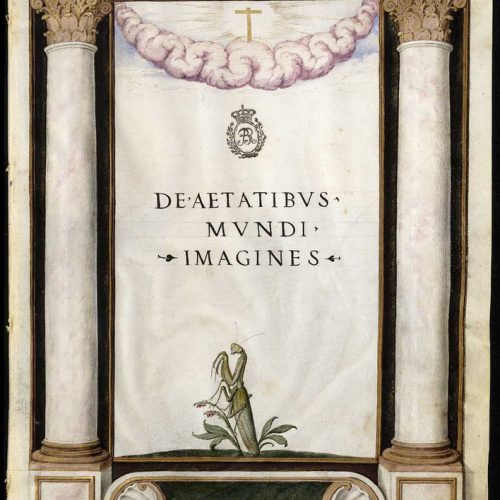
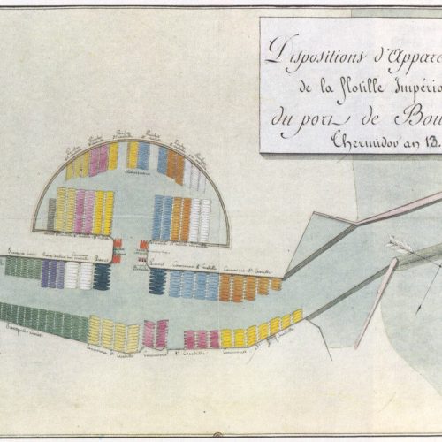
On a more real note than Prince Valiant’s plan below, here is the layout of Napoleon’s invasion force for England before he was forced to call off the operation. That’s a lot of ships.
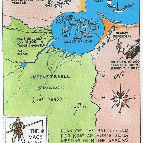
Prince Valiant’s battle plan to help the outnumbered King Arthur defeat the Saxons. So awesome.

Thank god for Facebook.